 |

PrimeFaces SelectOneButtonIt is used to select a single item from a list using buttons. It creates items list as a list of buttons. So, we can select item by clicking on the button. The <p:selectOneButton> component is used to create list of buttons in the JSF application. It has various attributes that are tabled below. SelectOneButton Attributes
SkinningFollowing is the list of structural style classes;
ExampleHere, in the following example, we are implementing <p:selectOneButton> component. This example contains the following files. JSF File// oneButton.xhtml ManagedBean// OneButton.java Output: 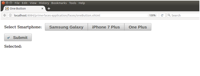 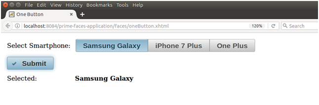
Next TopicPrimeFaces SelectOneRadio
|
 For Videos Join Our Youtube Channel: Join Now
Feedback
- Send your Feedback to [email protected]
Help Others, Please Share


Javatpoint Services
JavaTpoint offers too many high quality services. Mail us on [email protected], to get more information about given services.
- Website Designing
- Website Development
- Java Development
- PHP Development
- WordPress
- Graphic Designing
- Logo
- Digital Marketing
- On Page and Off Page SEO
- PPC
- Content Development
- Corporate Training
- Classroom and Online Training
- Data Entry
Training For College Campus
JavaTpoint offers college campus training on Core Java, Advance Java, .Net, Android, Hadoop, PHP, Web Technology and Python. Please mail your requirement at [email protected]
Duration: 1 week to 2 week


