| |

Visualization in KibanaIn this Kibana tutorial, we are going to learn about the Visualization in Kibana. We will learn how to use Kibana to create, edit, and customize the visualization in the Kibana according to the user's need. We will also learn how to use a pie chart and other different charts options in the Kibana to use the visualization effetely, how to create gauge chart, how to create the goal chart with the help of index, how to put aggregation on the gauge and goal charts. Overview of VisualizationTo start creating the visualization of the data in the Kibana, go to the visualization tab of the Kibana. Till now, as we have done many things in the Kibana tool, so we have created many of the visualizations yet, so the space is blank then there are no saved or created visualization. But if we would have created any of them in the past time, then they will be in the window that is Infront of you. Here we also have a button of the Create Visualization by clicking on which we can start creating the visualization. Click the Build a visualization button. Here we can select the option to visualize our data. In the previous chapters, we have learned and understood each of them in detail. Here we can select any type of chart that we want to create. Now once we are done with the selection of the type of visualization, now it's time to select the index on which we want to create the visualization. Creation of the Gauge Chart TypeA visualisation of the gauge shows how the metric considered for the data falls within the predefined range. A simulation of the goal informs us about your goal and how the measure on your data moves towards the goal. Go to Visualization to start using Gauge, and pick the Visualize tab from the Kibana 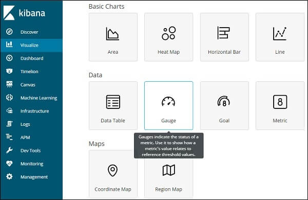
Click the Gauge button and pick the index to use. 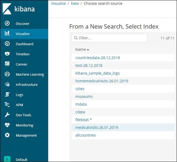
We will operate on the Index of medicalvisits-26.01.2019. Select February 2017 time range 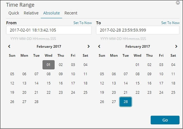
We can now pick an aggregation of metrics and buckets. 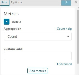
We have chosen Count as the metric aggregation. 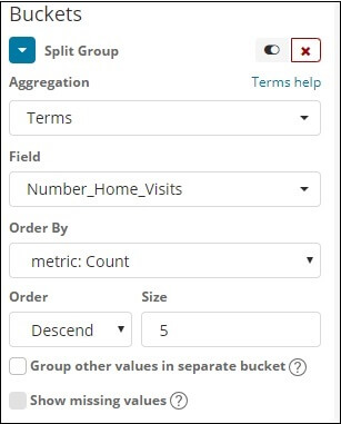
We have selected words for the bucket aggregation and the chosen field is Number Home Visits. The options selected from the Data Options Tab are shown below - 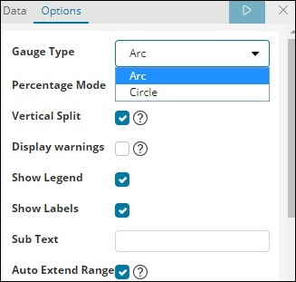
The type of gauge may be in the form of a circle or an arc. As the default values, we have picked all others as arc and rest. The predefined set that we have added is displayed here 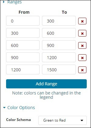
The chosen colour is from green to red. Now, to see the visualisation in the form of Gauge click on the Analyze button. It shows the Gauge, as follows. 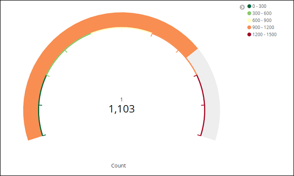
Functioning of Goal chartGo to the Visualize tab and choose Goal as shown below. 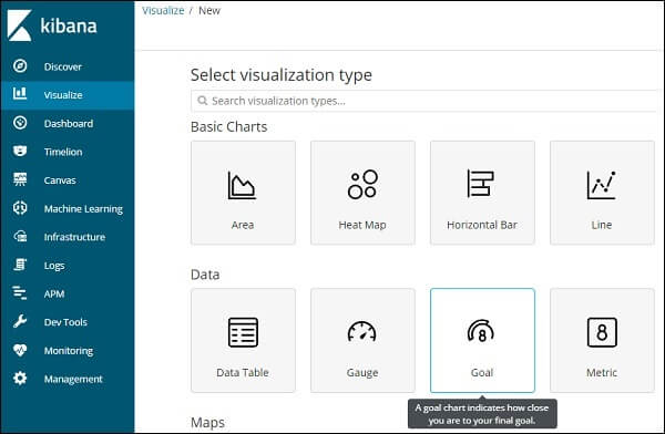
Please select a target and select an index. As the index, use medicalvisits-26.01.2019. 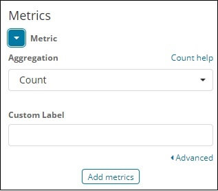
Pick the aggregation of metrics and bucket aggregation. Metric Aggregation 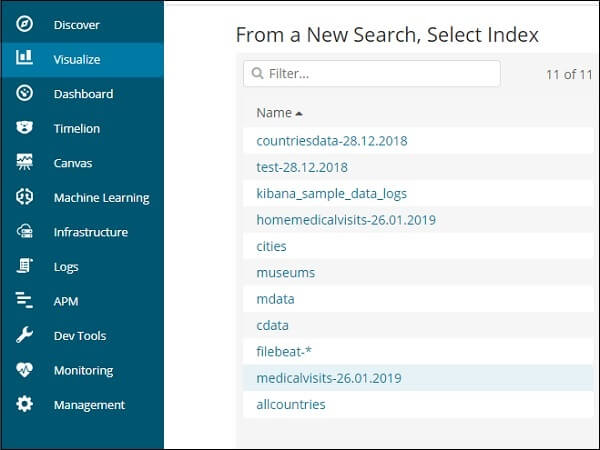
We chose Count as the aggregation of metrics. Bucket Aggregation 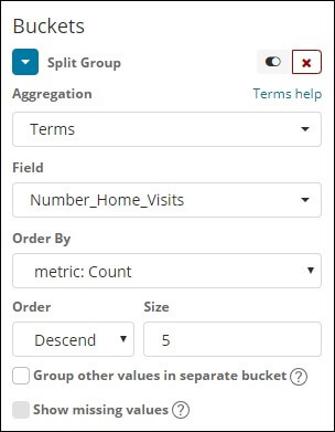
As the bucket aggregation and field is Number Home Visits, we have selected words. The selected choices are as follows: 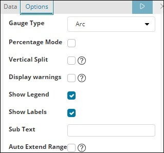
The selected range is as follows: 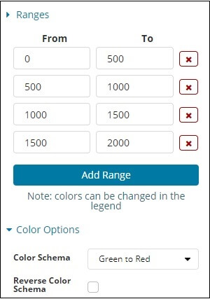
Click Analyze and we see the target shown as follows. 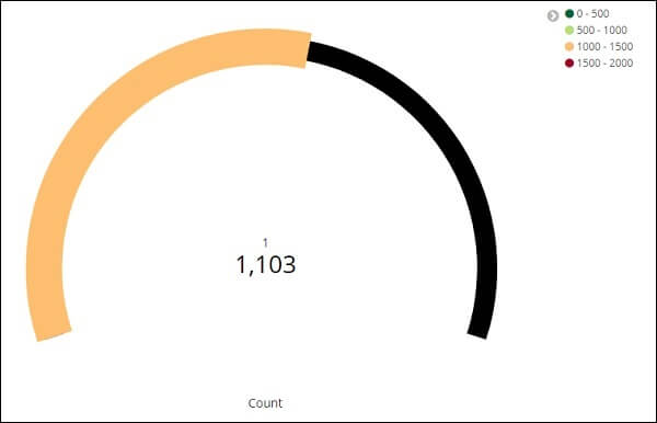
Next TopicCreation of Dashboard in Kibana
|
 For Videos Join Our Youtube Channel: Join Now
Feedback
- Send your Feedback to [email protected]
Help Others, Please Share


Javatpoint Services
JavaTpoint offers too many high quality services. Mail us on [email protected], to get more information about given services.
- Website Designing
- Website Development
- Java Development
- PHP Development
- WordPress
- Graphic Designing
- Logo
- Digital Marketing
- On Page and Off Page SEO
- PPC
- Content Development
- Corporate Training
- Classroom and Online Training
- Data Entry
Training For College Campus
JavaTpoint offers college campus training on Core Java, Advance Java, .Net, Android, Hadoop, PHP, Web Technology and Python. Please mail your requirement at [email protected]
Duration: 1 week to 2 week


