 |

Angular Material CheckboxThe <mat-checkbox> is used as an enhanced checkbox with content design styling and animation features. It provides precise functionality as a basic <input type = "checkbox"> content design enhanced with styling and animations. The checkbox label is provided as the content of the <mat-checkbox> element. The brand is posted by setting the Label Status property to 'Before' or 'After' before or after the checkbox. If you do not want the label to appear next to the checkbox, you can use aria-label or aria-label to specify a suitable label. Use with @angular/forms<mat-checkbox> is compatible with @ angular / forms and supports both FormsModule and ReactiveFormsMinule. Intermediate state<mat-checkbox> supports an indefinite state <input type = "checkbox">. Although the indefinite property of the checkbox is correct, it will render it as undetermined regardless of the checked value. Click on action configWhen the user clicks the matte-checkbox, the default behavior toggles the checked value and sets Uncertain to False. It provides functionality similar to a native <input type = "checkbox"> enhanced with <mat- <mat-checkbox> material design styling and animations. The possible values are: noopDo not change the indefinite value. Developers have the power to implement customized click actions. checkIgnore the indefinite value and toggle the checked value of the checkbox. If the checkbox is in an indefinite state then the checkbox will display as an indefinite checkbox of the checked value. check-indeterminateWhen the user clicks the mat-checkbox, set Uncertain to False. ThemingThe color of <mat-checkbox> will be changed using the color property. Checkboxes use the theme's accent color by default. It can be adjusted to 'Primary' or 'Warning'. Accessibility<mat-checkbox> uses internal <input type = "checkbox"> to provide an accessible experience. It receives the internal checkbox focus and is automatically labelled the text content of the <mat-checkbox> element. Createing Angular ApplicationFollow the steps to update the Angular application:
Let's see an example. The file is a modified module descriptor. app.module.ts app.component.html app.component.css app.component.ts Output: 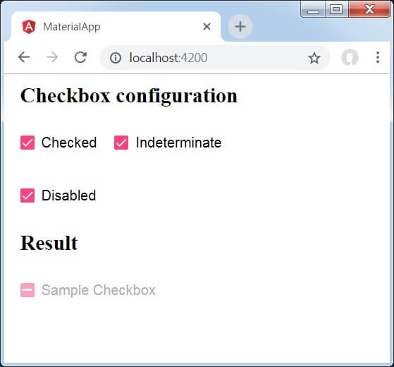
Previously, we have created three check boxes using mat-checkboxes and tied them using ngModel with variables. After that, we have created another checkbox and tied its various attributes with variables in the .ts file. Let's see another example to create check boxes. app.component.html app.module.ts app.component.css: Output: 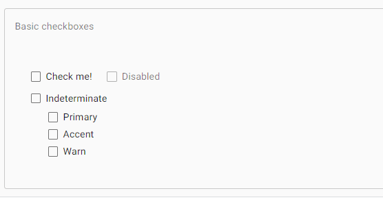
When we click on the check boxes, the boxes fill with color and a small check sign appears to it. 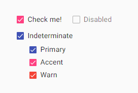
Next TopicAngular Material Sort Header
|
 For Videos Join Our Youtube Channel: Join Now
Feedback
- Send your Feedback to [email protected]
Help Others, Please Share


Javatpoint Services
JavaTpoint offers too many high quality services. Mail us on [email protected], to get more information about given services.
- Website Designing
- Website Development
- Java Development
- PHP Development
- WordPress
- Graphic Designing
- Logo
- Digital Marketing
- On Page and Off Page SEO
- PPC
- Content Development
- Corporate Training
- Classroom and Online Training
- Data Entry
Training For College Campus
JavaTpoint offers college campus training on Core Java, Advance Java, .Net, Android, Hadoop, PHP, Web Technology and Python. Please mail your requirement at [email protected]
Duration: 1 week to 2 week


