| |

R Data VisualizationIn R, we can create visually appealing data visualizations by writing few lines of code. For this purpose, we use the diverse functionalities of R. Data visualization is an efficient technique for gaining insight about data through a visual medium. With the help of visualization techniques, a human can easily obtain information about hidden patterns in data that might be neglected. By using the data visualization technique, we can work with large datasets to efficiently obtain key insights about it. R Visualization PackagesR provides a series of packages for data visualization. These packages are as follows: 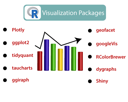
1) plotly The plotly package provides online interactive and quality graphs. This package extends upon the JavaScript library ?plotly.js. 2) ggplot2 R allows us to create graphics declaratively. R provides the ggplot package for this purpose. This package is famous for its elegant and quality graphs, which sets it apart from other visualization packages. 3) tidyquant The tidyquant is a financial package that is used for carrying out quantitative financial analysis. This package adds under tidyverse universe as a financial package that is used for importing, analyzing, and visualizing the data. 4) taucharts Data plays an important role in taucharts. The library provides a declarative interface for rapid mapping of data fields to visual properties. 5) ggiraph It is a tool that allows us to create dynamic ggplot graphs. This package allows us to add tooltips, JavaScript actions, and animations to the graphics. 6) geofacets This package provides geofaceting functionality for 'ggplot2'. Geofaceting arranges a sequence of plots for different geographical entities into a grid that preserves some of the geographical orientation. 7) googleVis googleVis provides an interface between R and Google's charts tools. With the help of this package, we can create web pages with interactive charts based on R data frames. 8) RColorBrewer This package provides color schemes for maps and other graphics, which are designed by Cynthia Brewer. 9) dygraphs The dygraphs package is an R interface to the dygraphs JavaScript charting library. It provides rich features for charting time-series data in R. 10) shiny R allows us to develop interactive and aesthetically pleasing web apps by providing a shiny package. This package provides various extensions with HTML widgets, CSS, and JavaScript. R GraphicsGraphics play an important role in carrying out the important features of the data. Graphics are used to examine marginal distributions, relationships between variables, and summary of very large data. It is a very important complement for many statistical and computational techniques. 
Standard GraphicsR standard graphics are available through package graphics, include several functions which provide statistical plots, like:
We use the above graphs that are typically a single function call. Graphics DevicesIt is something where we can make a plot to appear. A graphics device is a window on your computer (screen device), a PDF file (file device), a Scalable Vector Graphics (SVG) file (file device), or a PNG or JPEG file (file device). There are some of the following points which are essential to understand:
The basics of the grammar of graphicsThere are some key elements of a statistical graphic. These elements are the basics of the grammar of graphics. Let's discuss each of the elements one by one to gain the basic knowledge of graphics. 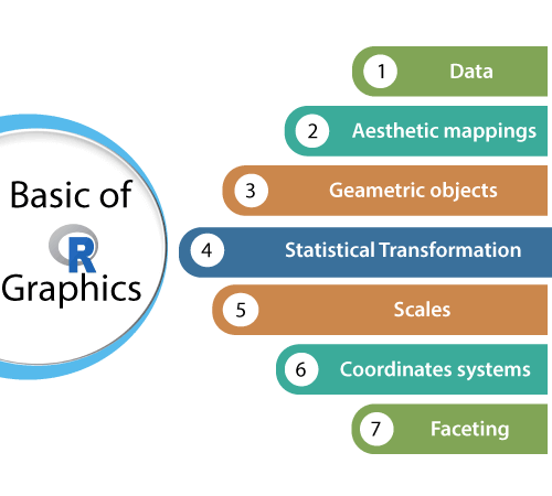
1) Data Data is the most crucial thing which is processed and generates an output. 2) Aesthetic Mappings Aesthetic mappings are one of the most important elements of a statistical graphic. It controls the relation between graphics variables and data variables. In a scatter plot, it also helps to map the temperature variable of a data set into the X variable. In graphics, it helps to map the species of a plant into the color of dots. 3) Geometric Objects Geometric objects are used to express each observation by a point using the aesthetic mappings. It maps two variables in the data set into the x,y variables of the plot. 4) Statistical Transformations Statistical transformations allow us to calculate the statistical analysis of the data in the plot.The statistical transformation uses the data and approximates it with the help of a regression line having x,y coordinates, and counts occurrences of certain values. 5) Scales It is used to map the data values into values present in the coordinate system of the graphics device. 6) Coordinate system The coordinate system plays an important role in the plotting of the data.
7) Faceting Faceting is used to split the data into subgroups and draw sub-graphs for each group. Advantages of Data Visualization in R1. Understanding It can be more attractive to look at the business. And, it is easier to understand through graphics and charts than a written document with text and numbers. Thus, it can attract a wider range of audiences. Also, it promotes the widespread use of business insights that come to make better decisions. 2. Efficiency Its applications allow us to display a lot of information in a small space. Although, the decision-making process in business is inherently complex and multifunctional, displaying evaluation findings in a graph can allow companies to organize a lot of interrelated information in useful ways. 3. Location Its app utilizing features such as Geographic Maps and GIS can be particularly relevant to wider business when the location is a very relevant factor. We will use maps to show business insights from various locations, also consider the seriousness of the issues, the reasons behind them, and working groups to address them. Disadvantages of Data Visualization in R1. Cost R application development range a good amount of money. It may not be possible, especially for small companies, that many resources can be spent on purchasing them. To generate reports, many companies may employ professionals to create charts that can increase costs. Small enterprises are often operating in resource-limited settings, and are also receiving timely evaluation results that can often be of high importance. 2. Distraction However, at times, data visualization apps create highly complex and fancy graphics-rich reports and charts, which may entice users to focus more on the form than the function. If we first add visual appeal, then the overall value of the graphic representation will be minimal. In resource-setting, it is required to understand how resources can be best used. And it is also not caught in the graphics trend without a clear purpose.
Next TopicR Pie Charts
|
 For Videos Join Our Youtube Channel: Join Now
Feedback
- Send your Feedback to [email protected]
Help Others, Please Share


Javatpoint Services
JavaTpoint offers too many high quality services. Mail us on [email protected], to get more information about given services.
- Website Designing
- Website Development
- Java Development
- PHP Development
- WordPress
- Graphic Designing
- Logo
- Digital Marketing
- On Page and Off Page SEO
- PPC
- Content Development
- Corporate Training
- Classroom and Online Training
- Data Entry
Training For College Campus
JavaTpoint offers college campus training on Core Java, Advance Java, .Net, Android, Hadoop, PHP, Web Technology and Python. Please mail your requirement at [email protected]
Duration: 1 week to 2 week


