 |

Bootstrap 5 AlertsThe bootstrap 5 alert component displays a preset message in reaction to a user's action. It sends information to end-users, such as errors, warnings, and confirmation messages. A limited set of configurable alert messages provide context-sensitive feedback for common user actions. Bootstrap 5 alert function uses the default alert box with other elements. The alert box uses a link, closing button, and animation on the web page. Default Alert functionWe can create an alert box by using the .alert class and contextual classes like .alert-success, .alert-info, .alert-warning, .alert-danger, .alert-primary, .alert-secondary, .alert-light, or .alert-dark. SyntaxThe following syntax shows basic alert box in the web page. ExampleThe following example uses basic alert box with different contextual classes. Here, we can place the short size information of the web page. Output The following output shows basic bootstrap 5 alert functions. 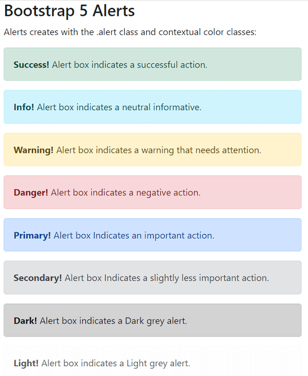
Bootstrap 5 Closing Alerts with a linkAdd a ".alert-dismissible" class to the alert container to dismiss the alert message. The class = "btn-close" and data-bs-dismiss = "alert" attributes are applied to a link or a button element. When we click on the cross symbol, the alert box disappears. To close the alert box, click the "x" icon to the right. The "×" is an HTML entity that, rather than the letter "x," is the chosen icon for close buttons. SyntaxThe following syntax shows closing alert box in the web page. The following syntax shows alert box with link in the web page. ExampleThe following example shows basic bootstrap 5 alert boxes with a close button. Here, we can use the link in the alert box. The example shows some alert boxes with links and others without links. The "light" alert removes using the cross button. Output The following image represents bootstrap 5 close alert boxes with the link. 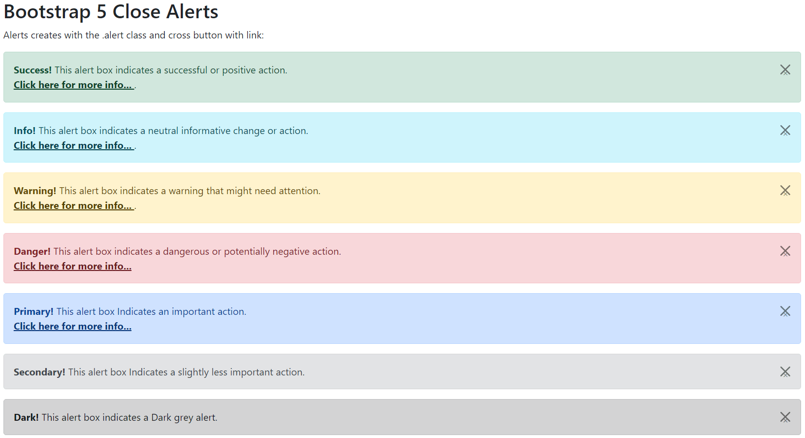
Animated alert boxTo close me, click the "x" sign to the right. I'm going to "fade" out. The .fade and .show classes create a fading effect when closing the alert message. The class = "btn-close" and data-bs-dismiss = "alert" attributes use in the <button> tag. When we click on the cross button, the alert box disappears with an animated effect. SyntaxThe following syntax shows animated alert box in the web page. ExampleThe following example shows alert box in animated format. Here, alert box shows and close functions use with special effect. Output The following output shows an animated bootstrap 5 alert function. 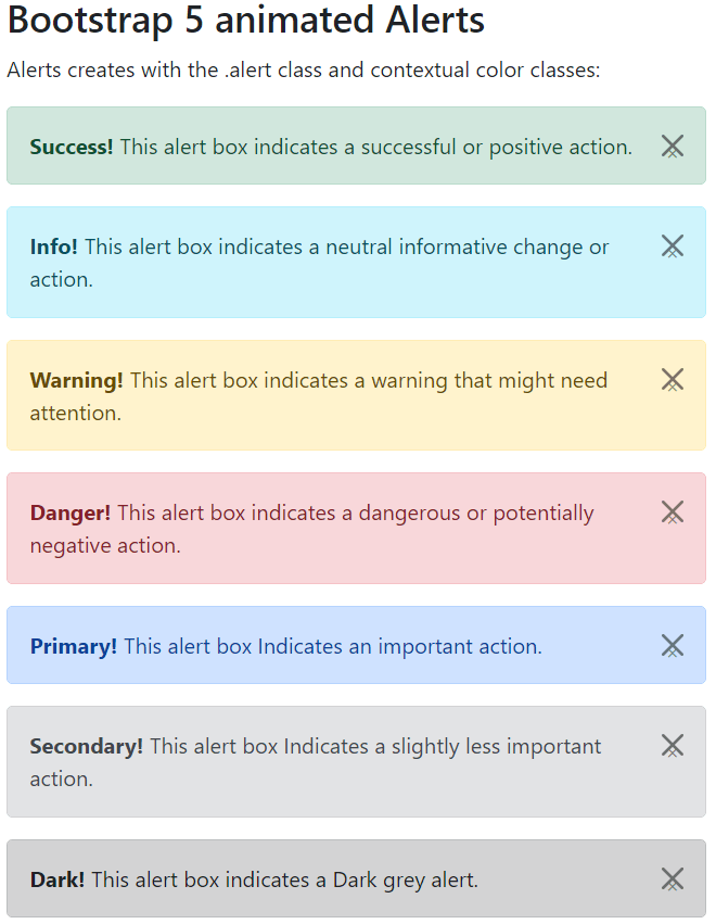
ConclusionThe bootstrap 4 alert function helps generate a brief area for element-specific information. The alert box offers an aesthetically pleasing and user-friendly message box within the application. It is an interactive user element for interpreting messages based on style and limited data.
Next TopicBootstrap 5 Badges
|
 For Videos Join Our Youtube Channel: Join Now
Feedback
- Send your Feedback to [email protected]
Help Others, Please Share


Javatpoint Services
JavaTpoint offers too many high quality services. Mail us on [email protected], to get more information about given services.
- Website Designing
- Website Development
- Java Development
- PHP Development
- WordPress
- Graphic Designing
- Logo
- Digital Marketing
- On Page and Off Page SEO
- PPC
- Content Development
- Corporate Training
- Classroom and Online Training
- Data Entry
Training For College Campus
JavaTpoint offers college campus training on Core Java, Advance Java, .Net, Android, Hadoop, PHP, Web Technology and Python. Please mail your requirement at [email protected]
Duration: 1 week to 2 week


