 |

Bootstrap 5 GridThe Bootstrap 5 grid system is designed with flexbox and supports up to 12 columns across the page. If we don't want to use all 12 columns separately, you can combine them to make wider columns. The grid system is responsive, and the columns will re-arrange themselves automatically based on screen size. It is not necessary to use all 12 available columns. Make sure the total is less than or equal to 12. We can utilize Bootstrap's default grid classes to easily create layouts for various devices like mobile phones, tablets, laptops, and desktops. For example, the .col-* classes can construct grid columns for especially small devices such as mobile phones in portrait mode, and the .col-sm-* classes for mobile phones in landscape mode. The following table shows the format of the bootstrap 5 grid systems. 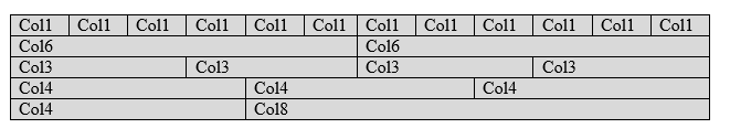
Default Grid SystemThe default grid system helps create columns using the "col" class for a single column in a row. We can use the "col" class twelve times to create twelve columns in one row. Syntax of the Grid System The default grid system in bootstrap 5 syntax shows below Examples The given example shows default grid system in bootstrap 5 with classes and function. The default grid system uses "row" and "col" class as per requirement. Here, we uses three "col" classes for three column in one row. Output: 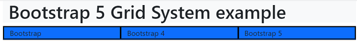
Grid System with SizeWe can apply the size of the column to create the customized column. The grid system helps create columns with the required size using the "col-size" class for a single column in a row. For example, the "col-3" uses to create three column sizes in one column. Syntax of the Grid System The bootstrap 5 grid system with size syntax shows below. Examples The given example shows default grid system in bootstrap 5 with classes and function. In this example, we can use column with sizes. First row uses uneven size of the column which total 12 column. Second row uses even size of the column which is 4 columns. We can use multiple column with equal to less than twelve column size. Output: 
Responsive Grid ClassesThe Bootstrap 5 classes use for a responsive grid system. The classes combine to create more dynamic and flexible layouts. The Bootstrap 5 adds an "xxl" breakpoint for a double extra-large device. The Bootstrap 5 grid system has six classes:
Syntax of the Grid System The bootstrap 5 grid system with size syntax shows below. We can use single or multiple grid class in one element. Example The given example shows default grid system in bootstrap 5 with classes and function. In this example, we use the "col-xxl" and "col-sm" classes in the container and container fluid element. Output: The following output shows the grid system for small and large screen width devices. This grid class uses container and container fluid. 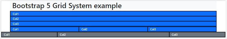
Example with grid classThe given example shows default grid system in bootstrap 5 with classes and function. If we need to use for small, medium, large, extra large and double extra large screen width then use "col-sm", "col-md", "col-lg", "col-xl" and "col-xxl" class respectively. Output The following output shows the grid system for a small screen width device. 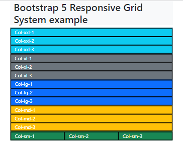
The following output shows the grid system for a double extra-large screen width device. 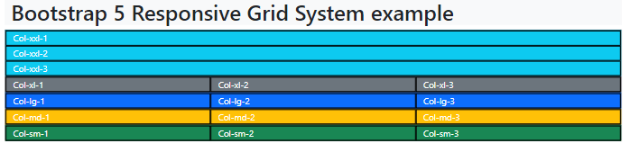
Stacked-to-horizontalLet's build a simple grid system that starts stacked on extra-small devices and becomes horizontal on larger devices. Example The following example demonstrates a simple "stacked-to-horizontal" two-column layout. It will result in a 50 percent or 50 percent split on all displays except exceptionally small screens, which will stack (100 percent). The example given shows the default grid system in bootstrap 5 with classes and functions. Output 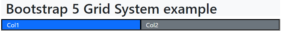
Auto-layout Grid SystemBootstrap will detect the number of columns and ensure that each column has the same width. To establish equal-width columns for all devices with Bootstrap 5, remove the number from .col-size-* and only use the .col-size class on a given number of col components. Bootstrap 5 columns should be responsive using the size classes. Example The given example shows auto layout grid system in bootstrap 5 with classes and function. The "col-sm" class uses on the container and container-fluid of the web page. The "col-sm" class uses for four time to create four columns. Output: 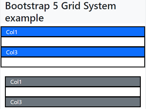
ConclusionThe bootstrap 5 grid system helps to create responsive, user-friendly, attractive, and simple web applications. It contains large size information in minimum space with user interaction. We can place multiple features on one page without complex space problems.
Next TopicBootstrap 5 Typography
|
 For Videos Join Our Youtube Channel: Join Now
Feedback
- Send your Feedback to [email protected]
Help Others, Please Share


Javatpoint Services
JavaTpoint offers too many high quality services. Mail us on [email protected], to get more information about given services.
- Website Designing
- Website Development
- Java Development
- PHP Development
- WordPress
- Graphic Designing
- Logo
- Digital Marketing
- On Page and Off Page SEO
- PPC
- Content Development
- Corporate Training
- Classroom and Online Training
- Data Entry
Training For College Campus
JavaTpoint offers college campus training on Core Java, Advance Java, .Net, Android, Hadoop, PHP, Web Technology and Python. Please mail your requirement at [email protected]
Duration: 1 week to 2 week


