 |

Bootstrap 5 ContainersBootstrap 5 Containers are a core Bootstrap building piece that contains and align your content within a specific device or viewport. The bootstrap 5 container contains responsive width with the required row and column for the advanced features and content. The container class works as fixed and responsive on the web page. Bootstrap 5 to Create ContainersContainers are the most fundamental Bootstrap layout elements necessary when using the grid system. Containers are mostly used to envelop material with padding. In the case of a fixed-width layout, they are also used to center the content horizontally on the page. Bootstrap 5 has three types of containers:
Bootstrap 5 "container" classThe container class contains content, navbar, image slider, and other functions with a grid system. It is a fixed-width container for web pages. The container class provides spaces inside the body section. It's placed in the center of the body section of the html page. Example The following example shows container in body tag with content. Bootstrap 5 uses the "container" class with "bg-info" background color. We can add row, columns and other features in the container tag. Output: The following image shows the output of the container class example. 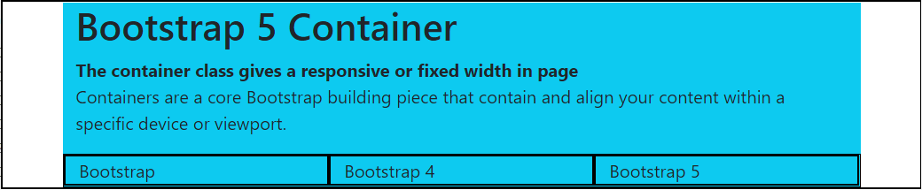
Bootstrap 5 "container-fluid" classThe container-fluid class contains content, navbar, image slider, and other functions with a grid system. The container class acquires space inside of the body section. If we need to use all space of the web page, then use the container-fluid class. It is a full-width container for web pages. Example The following example shows container in body tag with content. Bootstrap 5 uses the "container-fluid" class with "bg-info" background color. We can add fixed or responsive row, columns and other features in the container-fluid element. Output: The following image shows the output of the container class example. 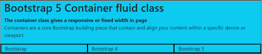
Bootstrap 5 responsive containerThe container-breakpoint class contains content and other functions with the grid system. The breakpoint places the size of the fixed-width for particular devices. The container class acquires space inside of the body section. The responsive container shows the container as per device width. The following table shows breakpoint with width size.
Example The following example shows a responsive container in a body tag with content. Bootstrap 5 creates a responsive container using the "container-breakpoint" class. The default class is "container" for all web pages. If we need to use for small, medium, large, extra large and double extra large then use "container-sm", "container-md", "container-lg", "container-xl" and "container-xxl" class respectively. Output: The following image shows the output of the container class example. 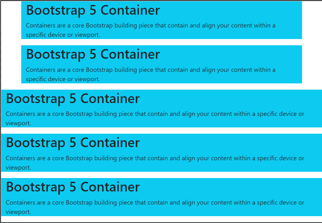
Padding for ContainersBy default, containers have left and right padding but no top or bottom padding. As a result, we frequently use spacing utilities such as extra padding and margins to improve their appearance. Container fluid does not have any padding on a page. We need to use padding with size and side. For example, the ".pb-size" class implies adding bottom padding with size. ExampleBootstrap 5 uses the "py-5" class for padding the container. The "py" works for spacing the top and bottom sides simultaneously. The container-fluid uses the "py" and "px" for vertical and horizontal padding with 5 sizes. The following example shows responsive container in body tag with padding. Output: The following image shows the output of the container class example. 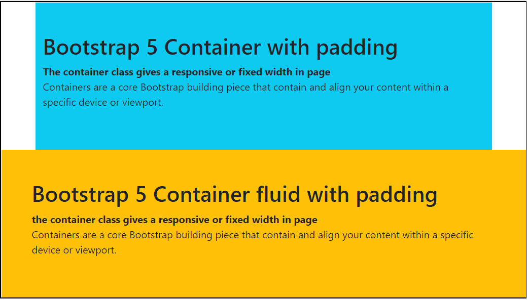
Border, Color, Margin for ContainersBy default, containers have left and right spacing but no top or bottom padding. As a result, we frequently use spacing utilities such as extra padding and margins to improve their appearance. Container fluid does not have any space on the page. We need to use margin for any side. For example, the ".m(side)-size" class implies adding the required side's margin with size. ExampleThe container uses "my-3" for horizontal margins such as the top and bottom side with the "3" size. The "border" class uses to create a border around the container, and the "text-white" class is for white color container content. The "bg-light" uses to display light grey background. The "bg-success" applies on the second container to set the green background. This container uses the "5" size margin from all sides using the "m-5" class. The container-fluid applies "bg-warning" with border and "m-5" margin. The following example shows responsive container in body tag with margin, border, and color. Output: The following image shows the output of the container class example. 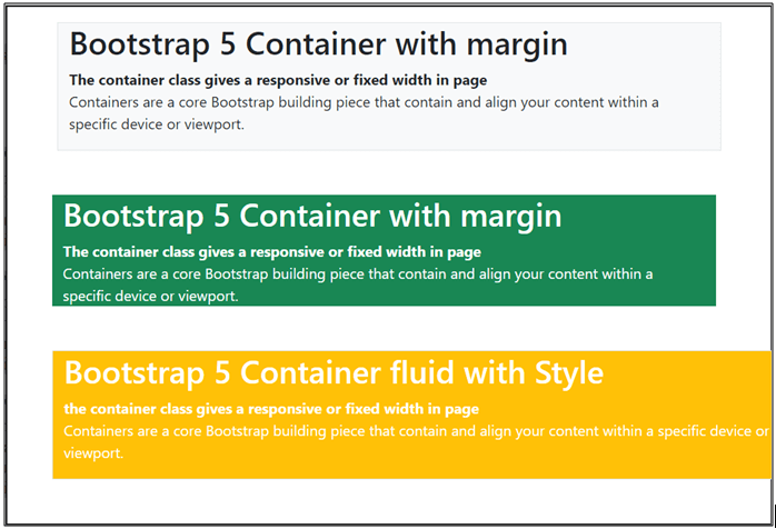
ConclusionThe bootstrap 5 containers contain content, features, and advanced functions of the web application. It is an essential part of bootstrap 5 to create a user interactive web page.
Next TopicBootstrap 5 Grid
|
 For Videos Join Our Youtube Channel: Join Now
Feedback
- Send your Feedback to [email protected]
Help Others, Please Share


Javatpoint Services
JavaTpoint offers too many high quality services. Mail us on [email protected], to get more information about given services.
- Website Designing
- Website Development
- Java Development
- PHP Development
- WordPress
- Graphic Designing
- Logo
- Digital Marketing
- On Page and Off Page SEO
- PPC
- Content Development
- Corporate Training
- Classroom and Online Training
- Data Entry
Training For College Campus
JavaTpoint offers college campus training on Core Java, Advance Java, .Net, Android, Hadoop, PHP, Web Technology and Python. Please mail your requirement at [email protected]
Duration: 1 week to 2 week


