 |

Materialize CSS CardsMaterialize CSS provides different CSS classes to apply various predefined visual and behavioral enhancements to display various types of cards.
ExampleLet's take an example to demonstrate the use of card classes to showcase various types of cards. Test it NowOutput: 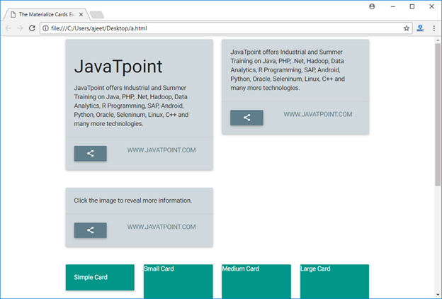
Next TopicMaterialize CSS Chips
|
 For Videos Join Our Youtube Channel: Join Now
Feedback
- Send your Feedback to [email protected]
Help Others, Please Share


Javatpoint Services
JavaTpoint offers too many high quality services. Mail us on [email protected], to get more information about given services.
- Website Designing
- Website Development
- Java Development
- PHP Development
- WordPress
- Graphic Designing
- Logo
- Digital Marketing
- On Page and Off Page SEO
- PPC
- Content Development
- Corporate Training
- Classroom and Online Training
- Data Entry
Training For College Campus
JavaTpoint offers college campus training on Core Java, Advance Java, .Net, Android, Hadoop, PHP, Web Technology and Python. Please mail your requirement at [email protected]
Duration: 1 week to 2 week
Like/Subscribe us for latest updates or newsletter 


