 |

Materialize CSS FormForms are used as a standard way to receive user inputted data. Materialize CSS provides a very beautiful and responsive CSS for form designing. The transitions and smoothness of these elements are very important because of the inherent user interaction associated with forms.
ExampleLet's take an example to demonstrate the use of input classes to showcase a sample form. Test it NowOutput: 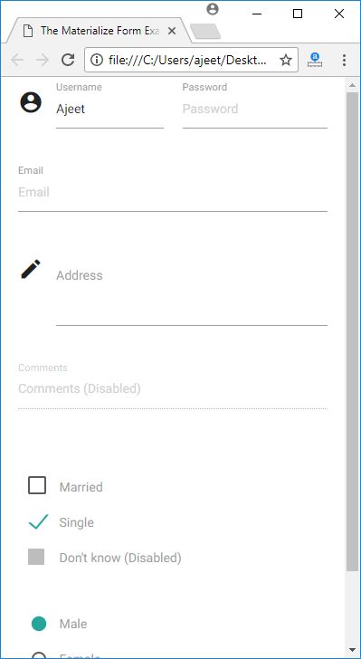
List of Input ControlMaterialize CSS offers several types of input controls. Following is a list:
Next TopicMaterialize CSS Icons
|
 For Videos Join Our Youtube Channel: Join Now
Feedback
- Send your Feedback to [email protected]
Help Others, Please Share


Javatpoint Services
JavaTpoint offers too many high quality services. Mail us on [email protected], to get more information about given services.
- Website Designing
- Website Development
- Java Development
- PHP Development
- WordPress
- Graphic Designing
- Logo
- Digital Marketing
- On Page and Off Page SEO
- PPC
- Content Development
- Corporate Training
- Classroom and Online Training
- Data Entry
Training For College Campus
JavaTpoint offers college campus training on Core Java, Advance Java, .Net, Android, Hadoop, PHP, Web Technology and Python. Please mail your requirement at [email protected]
Duration: 1 week to 2 week


