 |

Polymer App LayoutThe app-layout elements are comprised of components such as toolbars, drawers, and headers. These are used for building high-quality, responsive layouts just with markup. Some of the elements are listed in the following table. Table:
Example:Use the following command on command prompt to use app layout elements to move into the project directory. 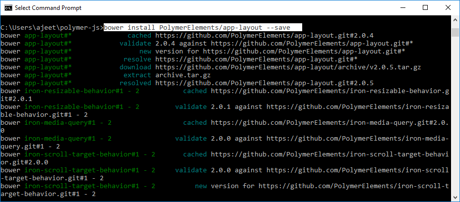
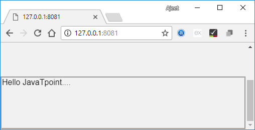
It will install the app-layout elements in bower-component folder. Then, you can import the file using <link> tag in your index.htmlfile. Output: 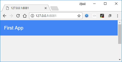
Next TopicApp Route
|
 For Videos Join Our Youtube Channel: Join Now
Feedback
- Send your Feedback to [email protected]
Help Others, Please Share


Javatpoint Services
JavaTpoint offers too many high quality services. Mail us on [email protected], to get more information about given services.
- Website Designing
- Website Development
- Java Development
- PHP Development
- WordPress
- Graphic Designing
- Logo
- Digital Marketing
- On Page and Off Page SEO
- PPC
- Content Development
- Corporate Training
- Classroom and Online Training
- Data Entry
Training For College Campus
JavaTpoint offers college campus training on Core Java, Advance Java, .Net, Android, Hadoop, PHP, Web Technology and Python. Please mail your requirement at [email protected]
Duration: 1 week to 2 week


