 |

ButtonIt is a control that enables the user to interact with the application. It is used to trigger the events performed by the user. It executes the custom code in response to user interactions. The buttons are one of the most important parts of iOS applications. Buttons are associated with the actions that are performed when the user interacts with the button. We can add the button to the iOS application programmatically or by using interface builder. The following steps are performed when the button is added to the application.
ExampleLet's create a very simple example in which we will add a button to our project and will create its action method in the View Controller class file so that it can perform some tasks on the touch events. Main.storyboardIn this example, we will add a button to the storyboard and give it background color, font size and title label using the attributes in the attribute inspector. 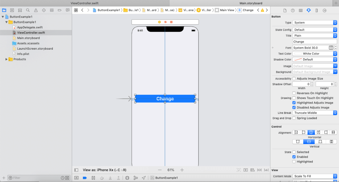
Action ConnectionTo perform any action on the button tap, we will connect an action of the button object in the ViewController class file. In this project, the background color of the main view will be changed on the button touch up inside event. 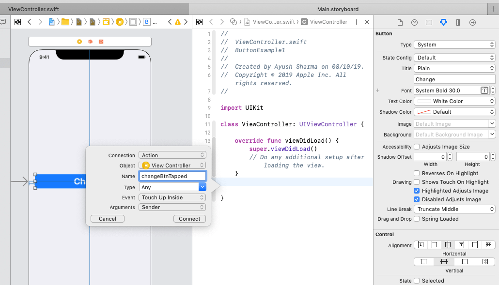
ViewController.class Output: 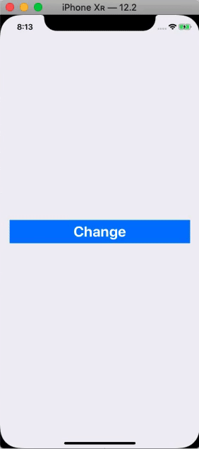
Configuring Button AppearanceThe type of button defines its appearance and behavior. We can define the button type in the storyboard file or using the init( type: ) method. Buttons can be of two types: System and Custom. Button StatesButtons can have five states
ContentThe content of the button indicates the behavior of the button to the user. In iOS applications, a button may contain a background image or a title label text to specify the content of the button. We may need to configure the UILabel and UIImageView objects to manage the content of the button. We can access the content of the button by using the titleLabel or imageView properties on the button object. 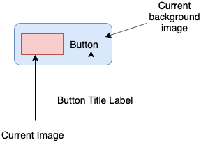
Interface Builder Attributes
Appearance Attributes
Edge Inset Attributes
Next TopiciOS TextField
|
 For Videos Join Our Youtube Channel: Join Now
Feedback
- Send your Feedback to [email protected]
Help Others, Please Share


Javatpoint Services
JavaTpoint offers too many high quality services. Mail us on [email protected], to get more information about given services.
- Website Designing
- Website Development
- Java Development
- PHP Development
- WordPress
- Graphic Designing
- Logo
- Digital Marketing
- On Page and Off Page SEO
- PPC
- Content Development
- Corporate Training
- Classroom and Online Training
- Data Entry
Training For College Campus
JavaTpoint offers college campus training on Core Java, Advance Java, .Net, Android, Hadoop, PHP, Web Technology and Python. Please mail your requirement at [email protected]
Duration: 1 week to 2 week


