Label
UILabel inherits the UIView class. It represents a class of views that display one or more lines of read-only texts. In iOS applications, the label is used in the association with UIControls to fulfill the Application requirements.
The syntax of the UILabel class is given as follows.
The appearance of the Label can be configured. We can customize the substrings within the label. The label can show attributed strings, as well. We can add the labels to the interface programmatically or by using a storyboard. The following steps are used to add the label to the interface.
- Search for the label in the Object library and drag the result to the storyboard or create an object of UILabel class in the ViewController class.
- Configure the appearance of the label using the attribute inspector.
- Set up auto-layout rules to define the size and position of the label in your interface.
Interface Builder Attributes for UILabel
| SN |
Attribute |
Description |
| 1 |
Text |
This attribute can be given to set the content of the label. To define the appearance of the label, we can assign two modes to the label i.e., Plain mode and attributed mode. Plain mode displays the label's content with the uniform appearance, whereas the attributed mode applies styling attributes within the string. In attributed mode, we can use the More menu to reveal additional appearance attributes. This value can be accessed at runtime with the text and attributedText properties. |
| 2 |
Color |
It is used to set the font color of the label. In plain mode, the color is set for the whole content, whereas, in attributed mode, we can define the color for a particular part of the content. |
| 3 |
Font |
This is used to alter the font of the label content. It includes the font family, size, and the opacity of the content. We can define the system or custom font to the label. In the custom font, we can set the font family and style of the label content. |
| 4 |
Alignment |
It is used to set the alignment of the label content within the frame. We can place the label content, left align, center, right-align, justified, or natural within the frame. In plain mode, the alignment is set for the whole label content whereas, in attributed mode, we can maintain the specific alignment for the specific paragraph of the label. |
| 5 |
Lines |
It represents the maximum number of lines the label uses to render the content. We can set it to 0 to make the label to render the unlimited lines. This value can be accessed at runtime by using numberOfLines property on the label object. |
| 6 |
Behavior |
This attribute is used to control the behavior of the label. The Enabled and highlighted control the appearance of the label. These values can be accessed at runtime by using isEnabled and isHighlighted property, respectively. |
| 7 |
Baseline |
It is a spacing attribute that controls the vertical alignment of the label when autoshrink is enabled. This value can be accessed by using the baselineAdjustment property. |
| 8 |
LineBreaks |
It specifies the behavior of the label when the content is too big to adjust within the label bounds. It can be set to word wrap or character wrap to break the content into multiple lines by words or by characters. This property can be accessed using lineBreakMode property on the label object. |
| 9 |
Autoshrink |
This attribute is used to alter the font size of the label content before resorting to the truncation. It can be set to either a minimum font scale or maximum font size. We can choose the minimum font scale and set the value to allow the label to reduce the font size to fit the text. |
| 10 |
Highlighted |
The color is applied to the text in the label when the highlighted attribute is checked. |
| 11 |
Shadow |
The default value of this attribute is transparent, which means no shadow appears beneath the text. However, we can mention the shadow color which rendered beneath the text of the label. This value can be accessed at runtime by using shadowColor property. |
| 12 |
ShadowOffset |
This property maintains the shadow offset. This value can be accessed using the shadowOffset property at runtime. |
Example
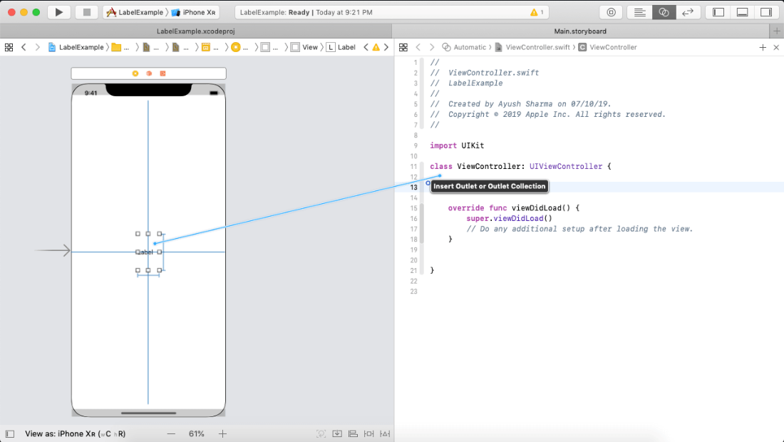
In this example, we will add a label to the ViewController using the interface builder, and customize the label appearance at runtime by creating the label outlet in the ViewController class.
To create an outlet, pick the control in the user interface for which the outlet is to be created, hold down the control key and drag from the control to the associated class as shown in the following image.
In ViewController class, we will set some properties for the label to customize its appearance at runtime.
ViewController.swift
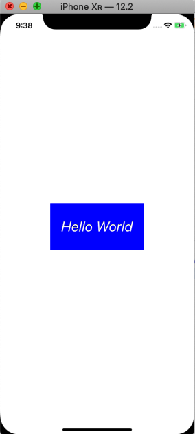
Output:
Example 2
Making the Label tappable
The following example will make the label created, in example 1 tappable. For this purpose, we will create an object of the class UITapGestureRecognizer.
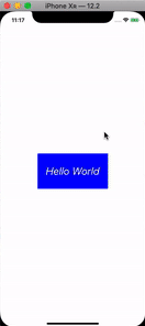
Output:
UILabel Properties
The UILabel object contains the following properties, which can be used to customize the runtime behavior of the label.
| SN |
Property |
Type |
Description |
| 1 |
text |
String |
It represents the current label text. |
| 2 |
attributedText |
NSAttributedString |
It represents the current styled label text. |
| 3 |
font |
UIFont |
It represents the font of the color. |
| 4 |
textColor |
UIColor |
It is the label text color. |
| 5 |
textAlignment |
NSTextAlignment |
It is the alignment of the text within the label frame. |
| 6 |
lineBreakMode |
NSLineBreakMode |
It is the technique used to wrap and truncate the multiline text |
| 7 |
isEnabled |
Bool |
The enabled state to use when drawing the label text. |
| 8 |
adjustFontSizeToFitWidth |
Bool |
It is a Boolean value which, when set, makes the label font size reduced to fit in the title string. |
| 9 |
allowsDefaultTighteningForTruncation |
Bool |
It is a Boolean value indicating whether the label tightens the text before truncating. |
| 10 |
baseLineAdjustment |
UIBaseLineAdjustment |
It controls the way baselines are adjusted when the text shrinks to fit in the label frame. |
| 11 |
minimumScaleFactor |
CGFloat |
It is the minimum scale factor for the label text. |
| 12 |
numberOfLines |
Int |
It represents the maximum number of lines the label text can have. Set it to 0 to make this unlimited. |
| 13 |
highlightedTextColor |
UIColor |
It represents the highlight text color applied to the label. |
| 14 |
isHighlighted |
Bool |
It represents a Boolean value indicating whether the label text is highlighted or not. |
| 15 |
shadowColor |
UIColor |
It represents the shadow color of the label text. |
| 16 |
shadowOffset |
CGSize |
It represents the shadow offset of the label text. |
| 17 |
preferredMaxLayoutWidth |
CGFloat |
It is the preferred maximum width for a multiline label. |
| 18 |
isUserInteractionEnabled |
Bool |
It is a Boolean type property. When set to true, it enables the user to interact with the label text. |
|

 For Videos Join Our Youtube Channel: Join Now


